Let's make a new palette of colours!
It's amazing the older you get, the quicker the months and years disappear behind you. So it seems it's already time to post another colour palette!
Each month, I am taking a photograph I quite like aesthetically and choosing a colour palette from it. Then from there, taking those colours and converting it to DMC flosses. Again, just in case [legal reasons and yada yada]; I'm not endorsed by the company DMC, I just love the quality and options provided.

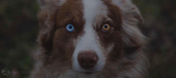
I really love the website Unsplash for high-quality, free-to-use, random stock photos (hence why I'm constantly referring back to the artist of whichever photo I do use!) so let's keep it going with making a DMC palette from another gorgeous photo via there?
So now we have our colour scheme, let's convert these RGB colours into DMC colours!
| RGB | DMC |
|---|---|
| 143, 175, 217 | 3755 |
| 197, 206, 217 | 3752 |
| 66, 64, 51 | 3031 |
| 166, 114, 70 | 420 |
| 115, 104, 104 | 317 |

Serene, calming colour palette.
I was pleasantly surprised after seeing these colours come together. I assumed it would be two vibrant, bright colours (the eyes) against some muted colours but it's a lot calmer than that is. I was a bit bummed that the deep, dark green couldn't be translated properly but honestly? The dark brown works so well that that's OK!
So keeping in mind there 16,777,216 different available colours when using the RGB scale ( 256×256×256) and only 500 colours in the DMC selection, sometimes getting the absolute perfect colour can be a bit tricky. Sacrifices and allowances must be made.
Looking at these colours together, I feel like it's easy to pick an image to use these colours with. An overcast beachy scene, for example, could work nicely! What kind of things can you see yourself making from these colours?


